

art school days
When I joined the HND Graphic Design course at Barnet College in the early 1980s, it felt like an exciting time to be learning the craft. Neville Brody was redefining typography, Channel 4 had just launched with its iconic identity, the Conran Group was producing beautifully considered design, and Memphis was showing that design could be playful as well as functional.
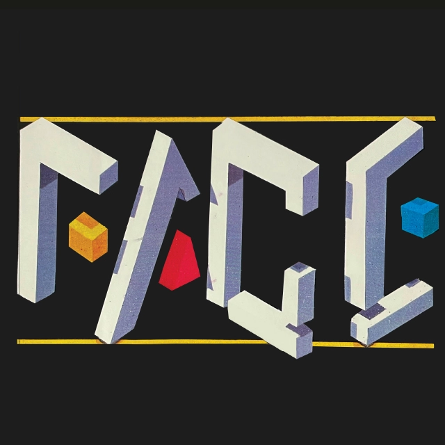
One project that has stayed with me was a logo redesign for The Face magazine. It was produced as a PMT (Photo Mechanical Transfer) using hand-cut Letrafilm-long before computers became part of the design process. Every line and every adjustment was made by hand. It demanded patience, precision and plenty of practice.
Those really were different days.

my times roman ‘S’
One of my final-year projects was to create a three-dimensional Times Roman letterform. I chose the letter ‘S’ and carved it from boxwood on a very modest student budget.
There were no computers, CAD software or CNC machines to help—just chisels, sandpaper and a lot of perseverance. The letter had to be carved in two sections before being bonded together. More than forty years later, it still sits in my studio. It’s a reminder of where everything began.
into london’s west end
One of my first freelance commissions came from Drawing Power Ltd on Tottenham Court Road-a Christmas brochurefor Leslie Davis, produced for Creative Direction Ltd, who would later become my employer.
Creating presentation visuals was a craft in itself.
The background was made by soaking layout paper in lighter fluid before blending Magic Marker ink across the surface with a tissue. The smell filled the studio, and by today’s standards it probably wasn’t the safest way to work—but it produced beautifully smooth colour gradients.
The lettering was painted by hand using white gouache, with a tiny drop of Fairy Liquid mixed into the paint to stop it bleeding into the marker background. Those little tricks were simply part of the job.
Every project taught me something.
Security Brochure Visual Captain Video Visual-long before Block- Buster arrived
Storyboard for DOW Chemicals featuring a Porsche

happy days
John’s first freelance commission came from Drawing Power Ltd on Tottenham Court Road. The project: the Leslie Davis Christmas Brochure. Produced for Creative Direction Ltd-who would later employ him-the finished visual combined technical skill and resourcefulness.
The background was created using layout paper soaked in lighter fluid to achieve a smooth blend. Magic Marker ink was applied with a tissue and carefully wiped across the saturated surface, filling the studio with its memorable (but flammable) scent. The typography was hand-painted using a brush and white gouache, with a drop of Fairy Liquid added to prevent bleeding into the background.
Other early work included:
- A House Alarm Brochure for an early adopter of pyramid selling.
- Captain Video – a forerunner to the Blockbuster video store concept.
- A visual for DOW Chemicals, featuring a paint-pour concept for Porsche, captured in a single storyboard frame.


studio talk – 1980’s style
Every design studio had its own language. A Scamp was a rough sketch where ideas first took shape.
A Finished Visual was a polished presentation, often using Letraset or other rub-down lettering made in-house using an Omnicrom system.
A Final Visual was something else altogether. These were often produced by specialist marker artists whose skill could transform a concept into something almost photographic.
One of the finest I worked alongside was Ron Wootton. Watching him work was remarkable-his speed, control and knowing where to include detail and where to exclude it was extraordinary.
A surviving Magic Marker sketch on scrap paper-created for Lornamead Cosmetics-is a nostalgic reminder of a time when every single visual was drawn by hand.
christmas pudding pack
This festive packaging concept was another beautiful piece of work by Norman Dance, combining Magic Marker, pencil and paint.
Although Norman was known primarily as an In-Transparency Retoucher, he was equally skilled as what studios then called a “Put-Down Man”—the person responsible for mounting finished artwork onto presentation boards with absolute precision.
They’re job titles that have almost disappeared today, but they were an important part of the design process.


lessons in freelancing
One brochure concept for Arasys weight-loss equipment remains memorable for reasons beyond the design itself.
The project was creatively successful, but payment never arrived. Eventually I had to pursue the matter through the County Court, where judgment was awarded in my favour. It wasn’t the most enjoyable lesson of my early career, but it taught me that running a design business involves much more than producing good creative work.

photocopiers, tipp-ex and ingenuity
When our studio bought its first A4 photocopier, it was supposed to make office administration easier.
Instead, the creative team immediately discovered dozens of ways to use it for design. Compared with the huge Grant Enlarger-which felt about the size of a telephone box and required painstaking manual tracing-the photocopier was revolutionary.
One rainy afternoon we were invited to pitch for Ernest Jones with an overnight deadline.
The brief was for The Diamond Experience, an event for selected jewellery stores. By ten o’clock the following morning the presentation boards had to be finished.
The background was built using C7 grey Magic Marker. Graduated squares were created with a spray marker, diamonds were photocopied from an existing advertisement, cut out by hand and carefully positioned, and the final highlights were added with white gouache using a fine brush.
It was a long night, but we delivered on time.
Fax me!
when the fax machine changed everything
The introduction of fax technology had a profound impact on the design process.
Visuals now needed to be reduced to simple, high-contrast linework to transmit clearly and quickly. Gradients and solid colour areas where avoided as they took so too long to transmit and clients complained both about the time and ink consumption.
Before this shift, visuals were hand-delivered to meetings by Account Directors or dispatched via motorcycle couriers racing through London traffic.
Fax approvals came with their own peculiarities – designers often had to guess which colours clients thought they had approved.
Fortunately, in the case of this jewellery brochure for Ratners, approved to go to artwork and production from this sketch, there was no doubting it’s colour – The Red Star Sale!
