

sometimes you’re just too early
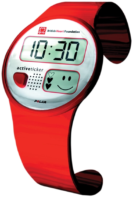
Every so often an idea arrives before the technology needed to support it. One concept I developed for the British Heart Foundation was called Activ Ticker—a wearable device that encouraged people to monitor their heart rate and become more active.
The response?
“A nice idea… but the technology doesn’t exist.”
Not long afterwards, Fitbit and similar devices appeared and suddenly wearable fitness technology became part of everyday life.
It was a gentle reminder that good ideas don’t always arrive at the right moment. Sometimes they’re simply ahead of their time.

a visit to wolff olins
One of the real highlights of the decade was collaborating with Wolff Olins during the launch of the World Gold Council’s new identity.
As someone who has admired their work for years, spending time in their studio felt a little like visiting a favourite football ground. There was inspiration everywhere I looked. Even the cafeteria walls featured graphics from their recent Sky rebrand.
My role centred on developing the website that accompanied the launch of the new WGC identity, alongside publications such as Gold Expressions and Gold Inspirations.
It was one of those projects where you come away having learned as much as you’ve contributed.


sometimes the right name is the one people already use
Baraclough & Stiles had been serving customers across the South East for decades. Working alongside Pearce Marketing, we carried out research with both staff and customers before making what turned out to be a very simple decision.
Everyone already referred to the business as Baracloughs.
So we did too.
The project involved much more than a new logo. It included a new website, communications around the name change, signage across ten branches, press advertising and point-of-sale material.
Sometimes branding isn’t about inventing something new. It’s about recognising what people already believe.

harvest farms
A conversation and a recommendation often lead to the most rewarding projects. Thanks to Roddy Paine, I was introduced to Harvest Farms, part of Creative Foods Europe.
What began as packaging design for frozen food products gradually evolved into something much larger.
Following Creative Foods’ acquisition by OSI Group, I was asked to help develop the environmental branding for a five-acre food production facility in Burton upon Trent, using the existing Creative Food’s Europe branding.
The work grew to include interior and exterior signage, wall graphics, historical timelines and wayfinding, before being adopted by other production across Europe.
Watching an identity grow from the UK across Europe was immensely satisfying. Thank you Nigel Parks.


schools that inspire
The education sector became another important part of my work during this decade.
It began with Holmewood House and grew into projects for Halstead School, King’s School Canterbury, Orley Farm School and Radnor House Sevenoaks.
Every school has its own personality. What I enjoy most isn’t simply designing identities—it’s listening to the people who shape those schools every day. Heads, bursars and marketing teams are some of the most passionate people I’ve met. They care deeply about the future of their pupils, and that enthusiasm is infectious.
One memory has stayed with me. During a photoshoot at Bethany School I completely lost my bearings and asked a pupil how to find reception.
He smiled and said,
“Please follow me and I’ll take you there.” Such a small moment. But somehow it spoke to me about the school. Those experiences always find their way into the design process.
Whether consciously or not, they become part of the story.
For Halstead School we developed an identity that extended far beyond a logo, creating a visual language that appeared across signage, uniforms, vehicles, digital media and printed communications. We even created what became known as the Halstead Braid, before producing a commemorative hardback book for the school’s centenary.


Bethany School creative platorm
The ‘Orbital’ creative platform was designed to express Bethany’s ‘Constellation of learning Habits,’ a philosophy that runs through the core of the school.
This identity had over 50 projects to address at launch, including three prospectuses, course guides, press and poster advertising, and a new website.


Projects for King’s School Cantebury, Orley Farm
Harrow, and Radnor House Sevenoaks

working with scientists
Another unexpected direction was life sciences.
Thanks to Steve Gardner and the team at Cresset, I found myself working alongside scientists, researchers and technology businesses tackling some remarkably complex challenges.
Designing in this sector isn’t about making science look attractive. It’s about helping people explain difficult ideas clearly enough for investors, partners and fellow scientists to understand. That responsibility never becomes routine.
The people I’ve met genuinely believe their work can improve lives, protect the environment and advance medical research.


Thanks to Steve Gardner and the team at Cresset, I found myself working alongside scientists, researchers and technology businesses tackling some remarkably complex challenges.
Designing in this sector isn’t about making science look attractive. It’s about helping people explain difficult ideas clearly enough for investors, partners and fellow scientists to understand. That responsibility never becomes routine.
The people I’ve met genuinely believe their work can improve lives, protect the environment and advance medical research.


emoji
a new visual language
One of the biggest shifts of the decade arrived in everyone’s pocket.
Despite what many people think, the word has nothing to do with emotion. It comes from the Japanese words e (picture) and moji (character).
Simple little symbols transformed digital communication by adding expression, humour and personality to text.
After spending a career helping organisations communicate visually, I couldn’t help smiling.
The rest of the world had finally discovered that sometimes a picture really is worth a thousand words
